Introducing best practices for content
Company
DemocracyLab
My Role
UX writer
DemocracyLab is a tech-for-good nonprofit that connects social entrepreneurs with skilled volunteers to collaborate on projects that advance the public good.
As the first UX writer on the design team, I partnered with designers, researchers, and developers across multiple initiatives, contributed to regular feedback sessions, and occasionally led weekly design meetings.
In addition to implementing UX writing best practices, I created the foundation for the company’s content style guide and supported new writers as they joined the team.
Much of the work shown below was also corroborated by user research findings, which were reviewed and compiled in collaboration with the research team
Error messages
Good copy prevents many errors—but not all. When they do occur, error messages must be clear, timely, and well-placed.
This example, part of the flow to create a new project, is part of a platform-wide update to ensure contextually relevant error messages.
Challenge
Error messages are currently listed as black bullet points at the bottom of the screen, making them easy to miss.
Solution
We added clear, instructional inline error messages, so users can easily fix a mistake and move on.
Sample of current and updated error messages
Clarifying instructions
Small copy updates can clarify expectations, reduce confusion, and improve a user’s overall sense of progress.
Sometimes, clarity trumps brevity
Challenge
The header and subheader copy was vague, leaving users unsure of what was being asked or how their information would be used. And optional fields still triggered errors when formatting was incorrect.
Solution
Provide clear, useful guidance that reassured users they could skip individual fields—or entire sections—if needed.
While UX writing often aims for brevity, this was a case where a little more text gave users the clarity they needed to move forward with confidence.
Before and after
Headers and subheaders
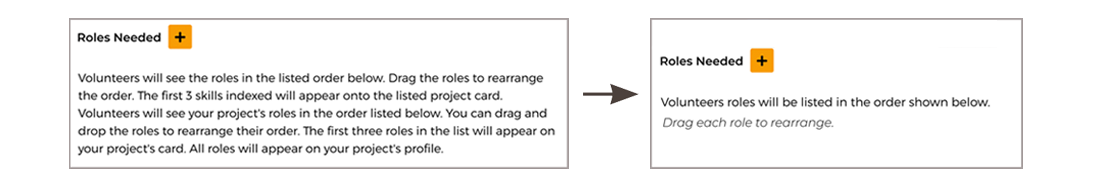
Other times, brevity is clarity
Challenge
If users need to find more volunteers for more than one role, they weren’t prioritizing the most important roles.
Solution
The was to add a tooltip were able to scale back the copy to offer clear, concise instructions.
Before and after
Step by step
Adapting to design updates
Clarity also comes from accuracy
Challenge
At the end of the project creation flow, the CTA read PUBLISH, setting expectations that their project would be immediately published. However, they would see a status of Unpublished on the next page, since projects first need to be reviewed and approved. This created both confusion and mistrust.
Solution
We updated the copy to align the interface with actual system behavior to set clear expectations and restore trust.
Header and subheader more accurately reflect the current step.
CTA text changed from PUBLISH to Submit Project.
→ Also updated from ALL CAPS to Title Case for consistency with style guide.Status text changed from Unpublished to Under Review.
Before and after
Destructive modal
Copy should be direct, unambiguous, and confirm intent to protect users from irreversible actions.
Challenge
Users weren’t warned that they might lose their progress in the volunteer application if they left the flow before submitting. This could lead to confusion and potential frustration.
Solution
After aligning with developers on when data could and couldn’t be saved, the modal copy was updated to clearly explain what happens if a user chooses to leave.
Language was softened (e.g. leave instead of discard) and made more consistent to reduce cognitive load.
Header text was updated to title case to align with the style guide.
CTA order was reversed to make No, Go Back the primary action—helping users avoid accidental exits.
Two versions of the message were created, depending on whether the user’s progress could be saved.
Before and after