Just for fun: Spec rewrites
If you listen closely, you can hear certain screens, components, or emails whisper urgently, “Please rewrite my copy!”
I’m just trying to be a good listener and help where I can. 😀
Select projects:
MyFTB emails
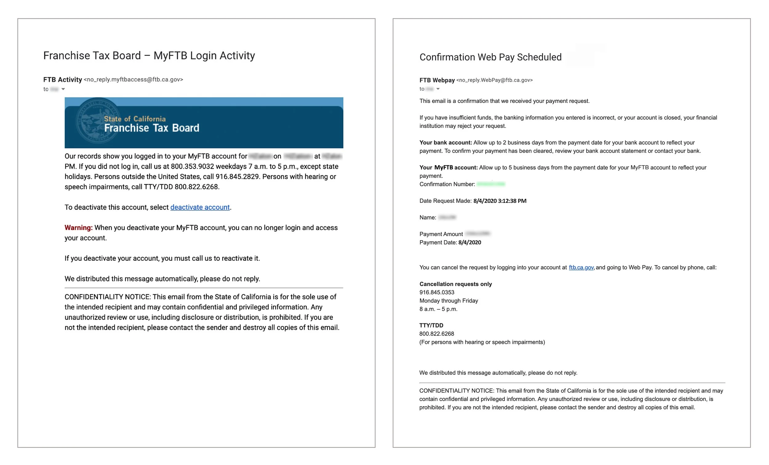
I received two emails from the California Franchise Tax Board (CA FTB) related to activity on their payment platform, MyFTB.
Given the rise in phishing scams—especially those involving payments—I was immediately skeptical, due to the following:
Even after confirming the emails were legitimate, they felt overly wordy and disorganized, making it difficult to identify the key information.
Although they referenced tax payments and included the California state seal, neither email offered clear reassurance that it came from a trusted government source.
It felt like the perfect opportunity to explore how content design could improve clarity, build trust, and reduce friction in an anxiety-prone context.
Considerations
I considered both the user and the context of these emails.
User: California taxpayer using the state’s online payment platform
Context: Communication related to state tax payments
MyFTB accounts are optional, so users who create one are likely comfortable with online payments and digital communication. Still, that doesn’t eliminate the anxiety many people feel around taxes or sharing personal information. And given the subject matter, these emails should strike the right balance in tone and voice.
Given these considerations, emails should:
Be easily recognizable before opening
Be concise and action-oriented
Follow a consistent structure to support readability and build trust
Use a voice that is authoritative yet approachable
Maintain a tone that is serious—but not overly formal—and always respectful of the user
I attempted to find data on California taxpayers to better understand the recipients of these emails. Unfortunately, I was unable to uncover specifics, so I referred to general best practices for email notifications to supplement my work on this project.
Notes
I noted areas that could be pain points or opportunities, as shown below.
Subject line should clearly reflect the purpose of the email to reduce confusion and improve visibility in a crowded inbox.
“From” address should align with the subject line to build trust and improve recognition.
Header image should be appropriately sized and included in both emails to reinforce legitimacy without overwhelming the layout.
Content should be organized with a clear visual hierarchy to reduce cognitive load and help users quickly identify what’s important.
Notes on the original emails
Proposed error page
The updated emails follow a consistent content pattern, with content reorganized by importance and excess copy removed (with some details moved to the website’s support section).


Intended result
These changes aim to make the emails easier to recognize in the inbox, improve readability, and create a sense of familiarity through repeated structure. Most importantly, they’re designed to instill confidence in the security of users’ tax-related activity, and build greater trust in the California Franchise Tax Board’s digital communications.
Hulu 404 error page
After landing on Hulu’s error page and finding a basic black-and-white design, I saw a missed opportunity to reinforce their brand, build trust, and connect with users—or potential subscribers.
While simplicity can be a strength, a simple page can still delight. As I explored how other companies approached their error pages, I found many had struck that balance, and set out to create a version for Hulu that could do the same.
Current Hulu 404 page (logged in)
Considerations
An error page doesn’t have to be a dead end. It’s a chance to keep users engaged and reinforce the brand.
Visitors to Hulu’s error page are likely trying to log in or explore the service. Since there’s no free tier, they arrive with expectations:
Paying customers expect a polished experience.
Potential customers are looking for a reason to subscribe.
Every page, including the error page, should reflect Hulu’s value. It can do this by:
Showing brand personality
Demonstrating usability (a thoughtful error page implies a thoughtful product)
Highlighting content available to subscribers
All of this should align with Hulu’s voice and tone to build trust, while keeping the focus on helping users get back on track.
Competitive research
I reviewed error pages from several streaming platforms: Netflix, HBO Max, Disney+, Prime Video, Roku, and Vudu.
Vudu stood out the most. Its error page rotates through a set of movie scenes, each paired with a modified film quote related to the error—and a link to watch the featured movie. It’s fun, on-brand, and offers a small surprise: A chance to explore a title the user might not have otherwise considered.
What’s missing is a secondary CTA. If the user isn’t interested in the featured movie, they’re left to navigate back using the main menu.
Disney+, Netflix, and HBO Max all offer strong error pages that feature content imagery and a short message, along with a clear CTA to return home.
Prime Video and Roku were less effective, with plain and uninspired error experiences.


Brand research
Hulu uses minimal text across their website, but I was able to find a few hints about their brand’s voice and tone.


Notes
I made notes of areas that could be pain points or opportunities.
Headline feels impersonal and off-brand. A more conversational message could better reflect Hulu’s tone.
“Okay” CTA doesn’t give users a clear next step. Where will it take them?
A text-only page feels like a missed opportunity for an entertainment brand. Visually showcasing content could keep users engaged.
The current footer is another missed opportunity to direct users to popular sections of the site. Or it can be below the fold and only accessible if users scroll. This would keep the focus on returning to the home page.
Notes on Hulu’s current 404 error page
Updated error page
While not a dramatic departure from Hulu’s existing 404 page, the revised version (for logged-in users) reflects the brand’s voice and tone, includes visual content, and offers a clear call to action.
Proposed Headline: We can’t find the page you’re looking for.
Body Text: But we know you’ll find something great to watch on Hulu.
CTA Button: Explore Hulu
Updates include:
More conversational tone
Search option added to header
Footer only visible on scroll
Visual hint of available content
Clear and actionable CTA


Intended result
Users who land on the updated page should still feel immersed in the Hulu experience—one that feels thoughtful, on-brand, and worthy of their subscription. The updated tone, added line of supporting text, and inclusion of content imagery all work together to reinforce Hulu’s value and help users get back on track
Update
When I revisited this project in 2025 (after learning that Hulu will merge with Disney+), I noticed that Hulu had updated their logged-out error page.
The revised message now includes “but we know you’ll find something great to watch on Hulu.” The similarity in language is a reminder that when you're designing with the user in mind, some content choices naturally align.

