Small copy updates for big impact
Company
Fiverr
My role
Content designer
The right words, right where they matter.
Simple, well-placed copy can turn friction into clarity, and routine moments into opportunities to connect.
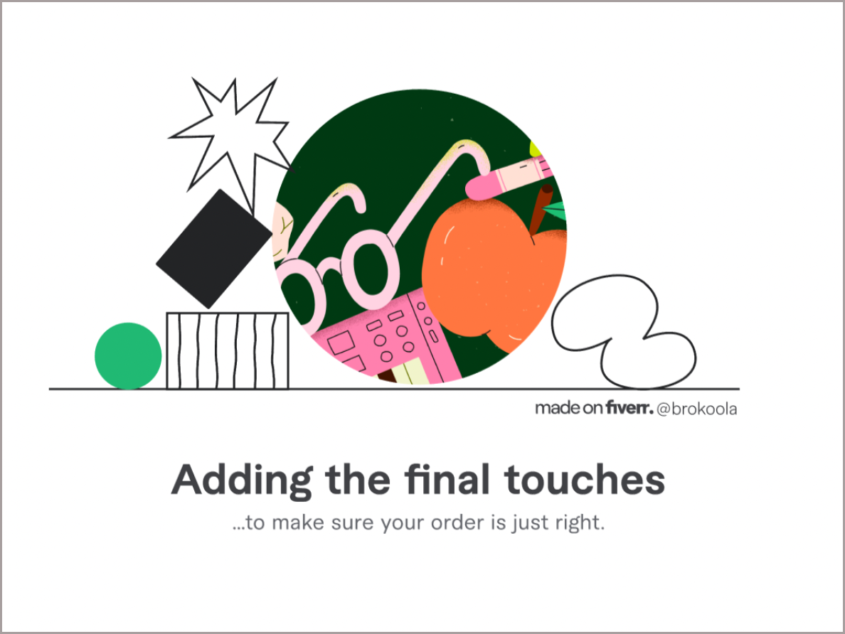
Loading screens, confirmation modals, and popups
Challenge
Freelancers can become frustrated while waiting for this screen to load after they’ve placed an order.
Solution
Upbeat copy—paired with images created by freelancers—offers a delightful distraction during a short wait.

Challenge
Maintaining client interest after they submit a brief.
Solution
A confirmation modal with playful, engaging copy still sets clear expectations for what comes next.
Plus, a message below the CTA upsells the mobile app with contextual relevance.

Challenge
To help users discover the new message forwarding feature on the Fiverr app, we needed a well-placed message that used the right tone.
Solution
This popup’s placeholder copy was updated by:
Making the header more conversational
Slightly editing the body copy for a tighter read
Removing unnecessary exclamation points
Email to request private review
Challenge
The original email was vague, didn’t set clear expectations, and lacked urgency in the subject line.
Solution
We rewrote the email with a friendlier tone and clearer structure:
Action-oriented subject line to stand out in crowded inboxes
Conversational, approachable headline
Clear distinction between public and private reviews
Simple explanation of the process ("3 quick questions")
The updates led to an immediate lift in submissions.
Emails
Before and after
Positive impact
Increase in completed private ratings
Mobile app feedback
Challenge
The existing feedback form lacked clarity and structure, resulting in vague or misdirected submissions. And users often submitted order-related concerns that should be directed to Customer Support, making the feedback difficult to organize or act on.
Solution
We introduced a more guided experience that helps users share ideas or report bugs in four specific areas.
Clear helper text redirects support issues appropriately, while friendly prompts walk users through the flow, with options to upload files and opt in for follow-up. This structure improves the quality and relevance of the feedback collected.

Users can find the Share feedback link in the app menu under Resources.
Share an idea
Report a bug
Mobile app release notes
Challenge
Release notes can be overlooked or reduced to vague phrases like “Bug fixes and improvements.” We saw an opportunity to infuse our brand personality and create a more engaging, user-friendly touchpoint.
Solution
I partnered with the mobile team for each iOS and Android release, turning the PM’s list of updates into clear, user-friendly notes that reflected our brand voice by:
Translating technical updates into user-friendly language
Infusing personality where appropriate
Tailoring messaging to fit platform constraints like Google Play’s character limit
We also built a bank of reusable notes for those inevitable “bug fixes and improvements” moments.
Sample:
If you pulled back the product and development curtain, you’d see us hard at work on upcoming features and improvements to existing flows. Just ignore the secret portal behind the water cooler. Last week, we sent an intern to see where it leads and she found an eerily similar office for a company called VerrFi.